Most of my web design career was spent focusing on graphic design, learning the software, keeping up with new technology, considering brand guidelines and adhering to what the client wanted. Little consideration was given to what the people using the websites wanted. In retrospect, it's strange I was never involved in any kind of user testing, despite freelancing for several top 100 agencies and a company creating digital material for the learning and cultural sectors in London.
A few years ago I shifted my focus from the desktop environment to mobile. It was only then did I start to understand the importance of designing for the people using the product. Contracting as a User Interface Designer for Polymorph, I gained valuable insight from great minds. They taught me how important User Experience is and that's when I realised I needed to get a much better understanding of it.
At the beginning of 2016, I started a project with an agency based in Johannesburg. I was to redesign the current software for their SaaS client. I had a lot to learn, and I had to start quickly. Here's what aided my crash course in User Experience design.
Where to begin?
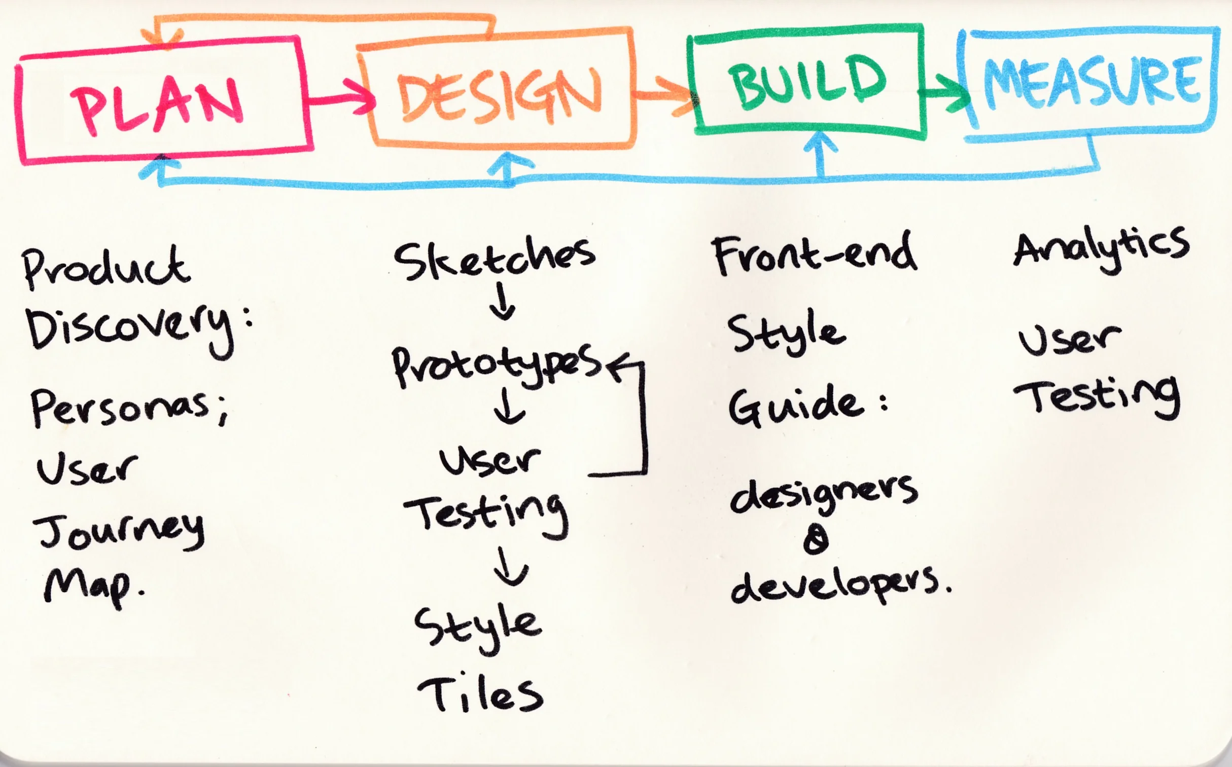
The most daunting part of any project. My advice for others is to seek guidance from people more knowledgeable than you. Steve Barnett put me on the right track. The workshops in the beginning of the project were useful and valuable. For instance, they taught me to ask the right questions. Steve walked us through the stages of the project:
Method sketch by Steve Barnett
I was relieved we had a direction and starting point, but wasn't sure how to go about the user research in the Plan phase - Product Discovery. I was already familiaring myself with the current software which was industry specific (lots of jargon!) and complex, but we needed to understand the people who use it and what their goals were.
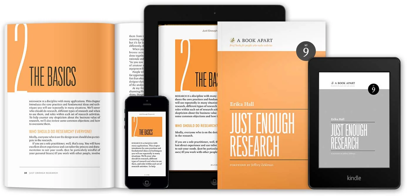
Steve recommended a great book to get started with:
Erika Hall's book is a succinct insight into user research. She manages to condense a lot of infomation into 154 pages. It's funny too - a real pleasure to read.
For practical guidance to conducting user research, I read Interviewing Users by Steve Portigal. Plenty of good tips and ideas.
I met with a few of the people using the software, spoke to stakeholders and inspected the google analytics statistics. With my new found knowledge of the target audience, I created Personas. I never really understood the importance of them until I created them myself. They are an important tool to help put the team in the shoes of the user/customer. They should be in the back of the whole team's mind when creating software. For a designer, It really does shift your focus from designing for designers to designing for users. This Smashing Magazine article explains the benefits of using Personas.
How to collaborate effectively with a remote team?
The Product Owner is based in Cape Town, where I am, so it's been helpful attending face to face workshops and brainstorm sessions. However, the development team is based in Johannesburg so the next challenge was how to collaborate better with them. They had a good solution: online software for whiteboarding. After some research, we chose RealtimeBoard which has been useful for documenting ideas, concepts and managing workflow. RealtimeBoard invited me to answer a few questions for an article about my experience with it. It was interesting to see their innovative approach to understanding some of their target audience (designers), while I was conducting my own user research. They have helpful templates which save a lot of time if you're trying something for the first time.
Persona template in RealtimeBoard
What are customer journey maps?
The great thing about UX is that there is so much information online. According to UX Mastery, a customer journey map is:
a visual or graphic interpretation of the overall story from an individual’s perspective of their relationship with an organization, service, product or brand, over time and across channels.
Using Realtimeboard to create/share diagrams and Mapping Experiences by James Kalbach as my tuitor, insight was gained into the customer's journeys within the software and the tasks they do during their work day. These diagrams enabled me to turn these observations into deliverables.
There are so many methods of creating customer journey maps, so the challenge is finding the most appropriate way to unlock knowledge about the customer. Nielsen Norman Group explains When and How to Create Customer Jouney Maps.
Sofia Hussain illustrates the experience of 'buying a home' as shown in Mapping Experiences.
What are impact maps?
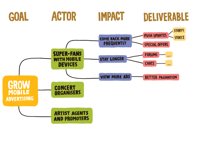
During a workshop, Steve suggested I try an impact map to gain knowledge of the business objectives of the organisation I was designing the software for. Not only should one be considering the customer's needs, but what does the organisation want to achieve?
Another good book recommendation: Impact Mapping by Gojiko Adzic. It's concise (I read it on the plane to meet the Johannesburg team) and easy to understand, due to helpful diagrams and straight-forward explanations.
This youtube clip expains the technique quite well.
An example of an impact map
What else to read?
Design of Everyday Things - Don Norman
Honestly, this took me ages to read. Finished after two attempts. The technical, science stuff can be boring if you're not used to reading these types of things. Glad I persisted, as there are such valuable insights that will stay with you while you design digital products.
Don't Make Me Think - Steve Krug
Experienced designers should be considering much of what Steve preaches in their designs already, but this is a good reminder of the things that make digital design usable. I struggled with the unattractive cover design and the website examples shown in the book, but if you can apply these fundamentals to aesthetically pleasing designs, then you're doing things well.
UX, UI, and Usability - What They Are & How They Differ
Abdul Suleiman’s article explains the differences between these three fundamentals in detail with well researched examples.
In conclusion
I believe the research has helped me design a much better system (so far). As we wireframe and prototype our ideas, we have been doing workshops with users of the current system to make sure we are creating functionality that will help them with their tasks. It's important that we keep testing the prototype across a range of the target audience, so we can get feedback to enable us to create a helpful, usable tool that will improve the quality of their work life.
I have a lot to learn still, and with technology changing so fast, it's important to keep current. Follow UX experts on twitter, go to conferences, sign up to the newsletters and read the books (so much free stuff online). That's what helping me learn.


